
LPLA is an Egyptian skincare and beauty brand built to stand on the same shelf as international labels. We named it, built its identity and designed packaging for its full 8-product range, in just 10 working days.
PROJECT DETAILS
NAME
LPLA
COUNTRY
Egypt
SERVICES PROVIDED
Naming, Brand Strategy, Visual Identity, Packaging Design
YEAR
2024

PROJECT OVERVIEW
A premium Egyptian client came to us with a skincare and beauty line and one ambition: a local brand that looks, feels and sells like a global one. There was no name, no identity and no packaging yet. In 10 working days we delivered the name, positioning and tone of voice, the logo and monogram, typography and colour, packaging for all 8 products, and the retail, print and social collateral, handed over as print-ready files. Manufacturing followed as a second phase.
CHALLENGE
Luxury beauty brands are usually built over months. LPLA had 10 working days to go from a blank page to print-ready files, and still had to sit next to international brands customers already trust. There was no room for long rounds of revisions: the name, the identity and a packaging system for 8 different products all had to land right the first time.
SOLUTION
We ran LPLA as a focused 10-day sprint with clear daily outputs: strategy and naming first, then identity, then packaging and rollout. The name comes from four words that define how the brand wants women to feel: Looks, Pretty, Lovely, Attractive. A high-contrast serif wordmark with an italic "la" gives it editorial elegance, the LP monogram works on caps, seals and signage, and a coral, cream and black palette makes all 8 products instantly recognisable on the shelf. Everything was delivered as print-ready files, ready for manufacturing.
Working days from blank page to print-ready brand
Products designed under one packaging system
The 10-Day Sprint
Most luxury brands take months to build. LPLA had 10 working days. We planned the sprint backwards from the deadline, with one clear output per day, so every decision fed the next one and nothing had to be reworked.

The Brand
Name & Positioning
The client wanted a name that sounds international but carries a clear feeling. LPLA is built from four words: Looks, Pretty, Lovely, Attractive. Short, easy to say in any language, and a promise in itself. Around it we set a tone of voice that is always elegant and refined: no slang, no hard selling, just quiet confidence.


Logo & Monogram
The wordmark pairs an upright, high-contrast serif with an italic "la", a small shift that makes the name feel personal and feminine. The LP monogram takes over where the full name doesn't fit: caps, seals, stickers and store signage.

Typography & Colour
Scotch Display brings the editorial, beauty-magazine feel to headlines, while Ofelia Text keeps ingredients and product details clean and readable. The palette is built on coral, cream and deep black: warm and feminine, but with enough contrast to look premium on any shelf.


The Packaging
One System, 8 Products
Instead of designing 8 separate labels, we designed one system: a fixed logo position, a clear product hierarchy and a colour code that changes by range. New products can be added without breaking the shelf look.


Brand in Use
Campaign & Social
We set the visual language for launch content: "Discover the Magic of LPLA" and "Behind the Beauty" campaigns, social templates and posters, so the brand looks consistent from day one.


Retail & Unboxing
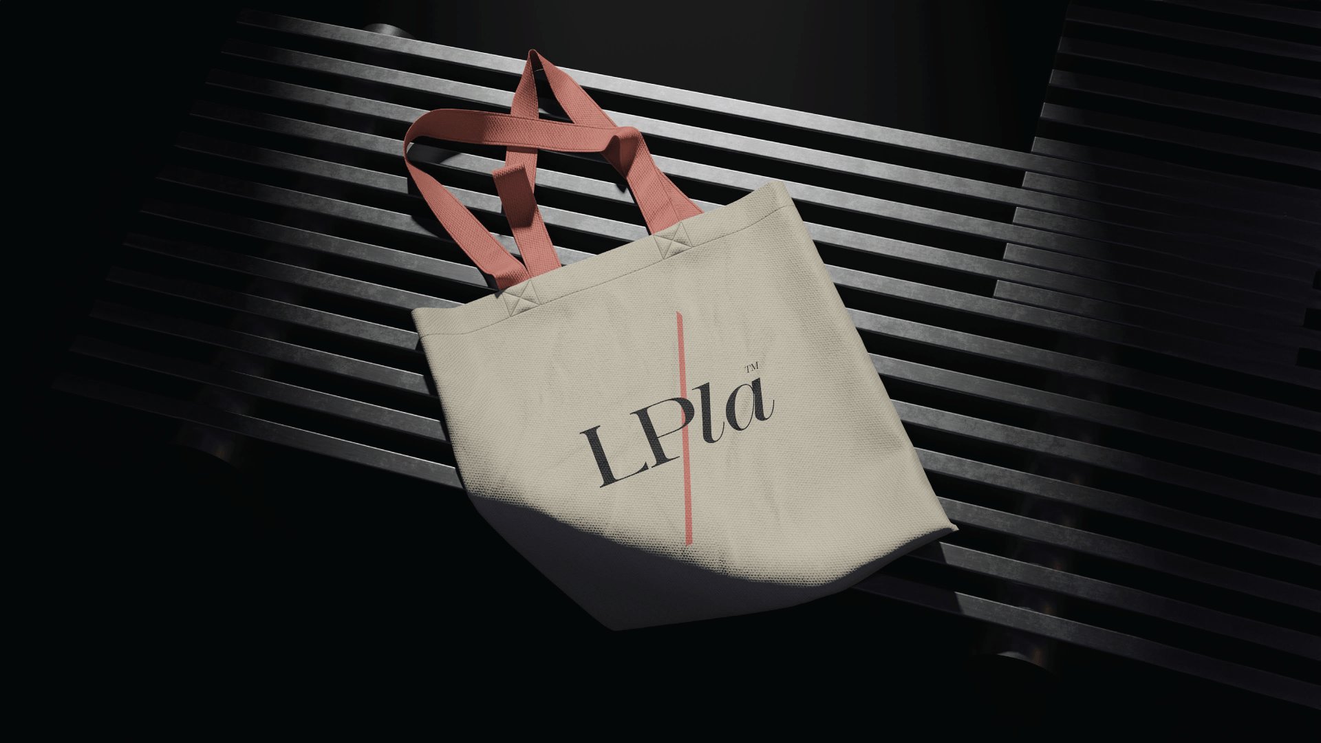
From the store sign to the shopping bag and the gift box, every touchpoint carries the same coral, cream and black language.


From Files to Shelf
On day 10 the client received the full brand book and print-ready files for every product and touchpoint. In a second phase, we took LPLA into manufacturing and print, turning the files into real products.


